ILUX

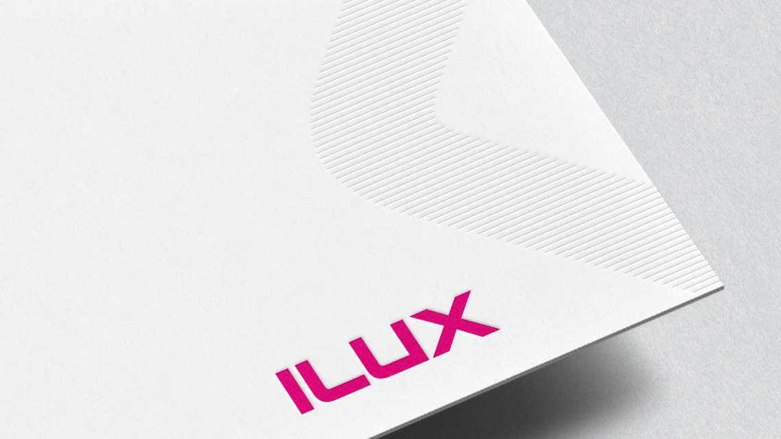
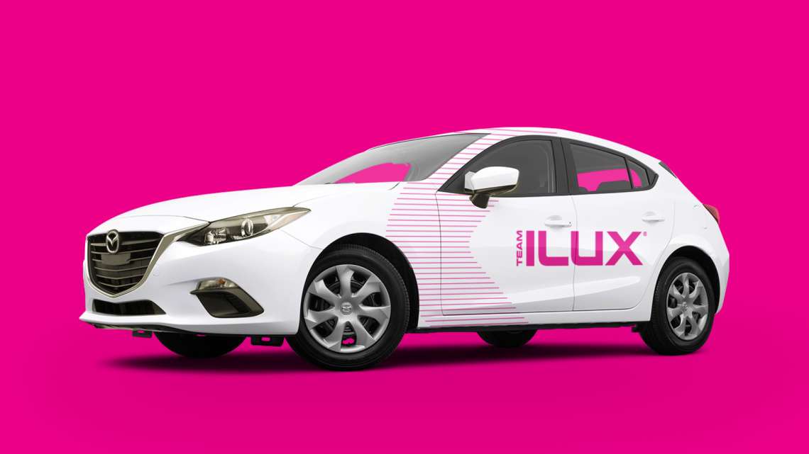
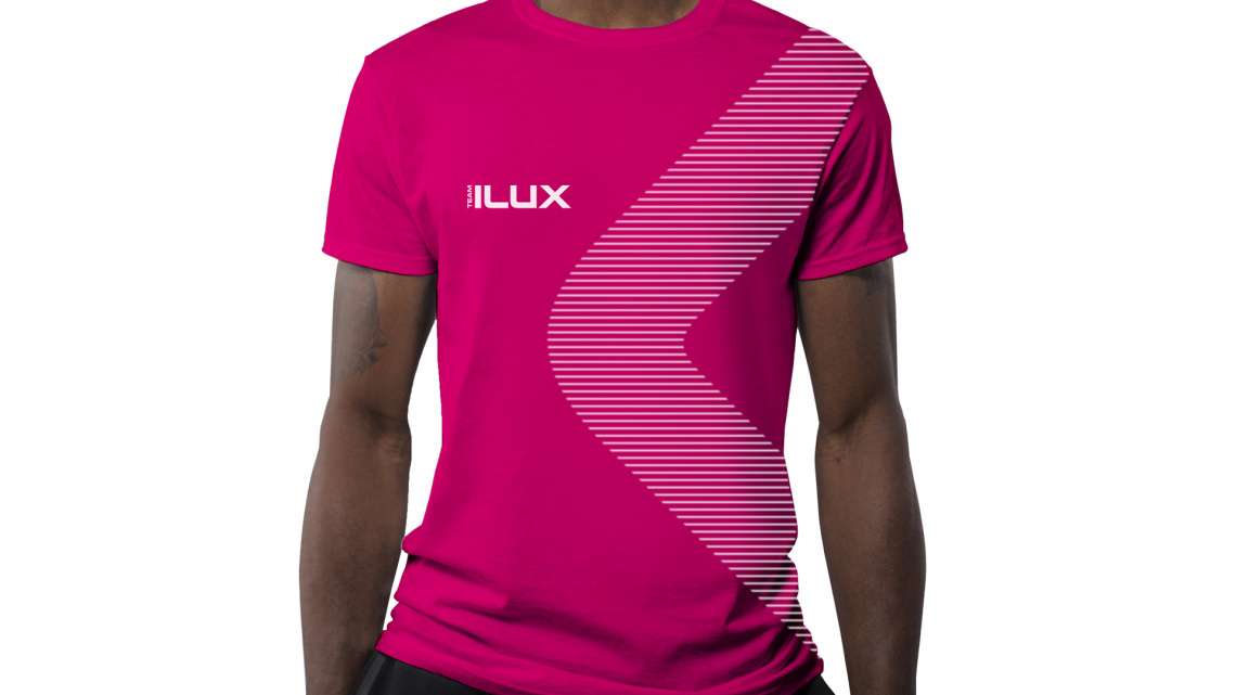
With a desire to improve their marketing efforts, ILUX appointed Mobas to redefine their brand in order to give them standout in a much-crowded marketplace and highlight their key point of difference.

Finding equity in what already exists

Since the company’s launch in 2008 the fundamentals of the brand had remained relatively untouched. After going through a robust strategy project with the team at Mobas including desk research, client and employee interviews and internal workshops, a new brand essence was developed: Powering success. Off the back of this work it soon became evident that there was no real need to redesign the brand as such, as it already had strong standout in the marketplace and already reflected the essence of the brand, as well as holding a lot of equity.

Ilux

A fresh approach

While the brand logo remained untouched, a new colour palette, graphic device, typography and photographic style were developed to represent the brand’s personality, values and mission. To work alongside the bright, bold magenta colour featured in the logo, a primary colour palette was developed featuring a light grey, black and white to be supported by a bolder secondary palette.

Ilux

Increasing brand recognition

A graphic device was designed to give the brand a visual hook greater than just the logo, enhancing brand stand-out and recognition across materials. Developed from the shape of the L and X in the logo, the graphic device has been designed to be used both as a solid shape and as a line-filled object, giving it a subtle nod back to the brand’s technology background.

Ilux-4

Deployment of the brand

The new brand look and feel was deployed through many of ILUX’s marketing touchpoints from a new website through to cars and merchandise.

Ready to talk?
Start your transformation today.