From the runways to TikTok, lavender’s popularity has been on the rise these past few years, and with Pantone’s latest colour of the year selection, ‘Very Peri’, we’ll no doubt be seeing a lot more of it in 2022. Senior Account Manager Emily Hutson explains why.
According to Pantone’s website, “Very Peri displays a spritely, joyous attitude and dynamic presence that encourages courageous creativity and imaginative expression.” No pressure!
If you want to go down the rabbit-hole that is colour psychology, purples are always an interesting read. Lavender tones occupy the liminal space of being both feminine and masculine: a symbol of spring, new beginnings and Easter for the Christian faith, while representing decadency, sexual feminity and patriarchy.
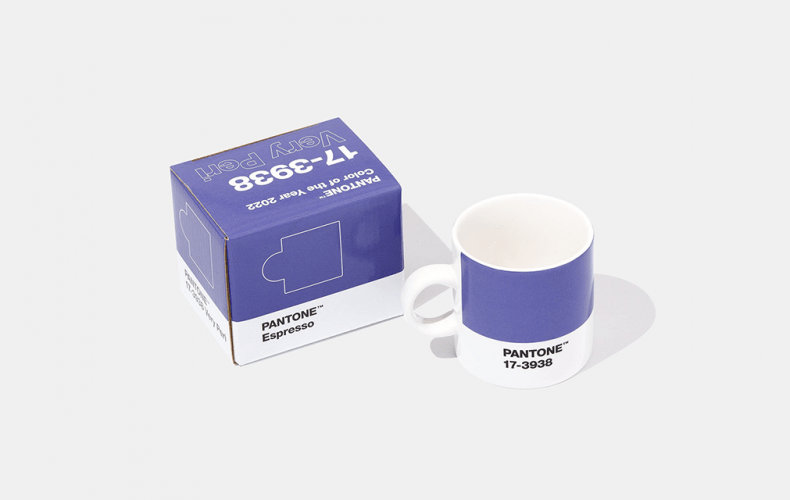
As we can see, lavender is a veritable melting pot of quite disparate imagery and emotions, a mix of blue and red, cold and hot. With this in mind, it’s unsurprising to read that Very Peri is a completely new shade that has been created by Pantone for 2022, “encompassing the qualities of the blues, yet at the same time possessing a violet-red undertone” – the blue indicating “constancy” and the red “energy and excitement” resulting in the multiple adjectives that Very Peri as a shade must convey.

Being ‘carefree’ and ‘daring’ is all well and good, but does Very Peri have what it takes to keep us ‘constantly excited and energised’ as the UK creeps into the perennial long winter and a new unpredictable series of lockdown measures? If the various hues of Very Peri that Microsoft Teams has presented me with day in, day out for the past 18 months are anything to go on, I wouldn’t count on it.

I would argue that just like Pantone’s 2021 colour selections of Ultimate Gray and Illuminating, the first colour pairing to share the prestigious title, and as I and many commentators felt, more reminiscent of road markings than the dual nature of the pandemic year it attempted to evoke, Very Peri makes sense on paper but doesn’t quite deliver what it says on the tin.
Nevertheless, as Steff Yakota relays in her analysis of Very Peri for Vogue, “At least it’s a new colour!”