The visual identity of a brand is everything – it captures the audience, breeds familiarity and develops authority. Lead Creative, Greg Bryant, explores how ITV’s latest brand update has potentially missed the mark.
I really loved the curved ITV brand when it launched a couple of years ago.

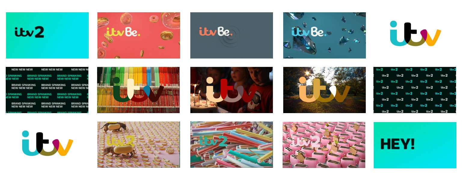
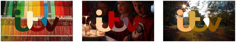
The logo style looked, and still looks great, I love the way that it has core colours but when used to promote particular broadcasts, or running with an emotive spot, it takes its colours from key points within the image on screen utilising its environment. It was one of those rebrands that you see and just know that the creatives got it bang on. It’s fun.
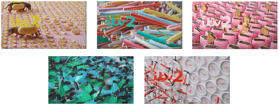
Even the sub channels – ITV2, 3, 4 and Be were great. I loved the quirky, younger feel used for ITV2 previously, clunking sticks of rock, hammers thrown at clocks, smashed cups of tea, hot dogs, flipping flippers and fans with ties attached. The endless amount that continued to surprise and make me smile. All with a beautifully strong palette supporting.
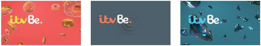
I love the pulsating ‘dot’ used on ITVBe, the (slightly) more subtle female-focused items and the powerful colours surrounding it. It really fits with the content.
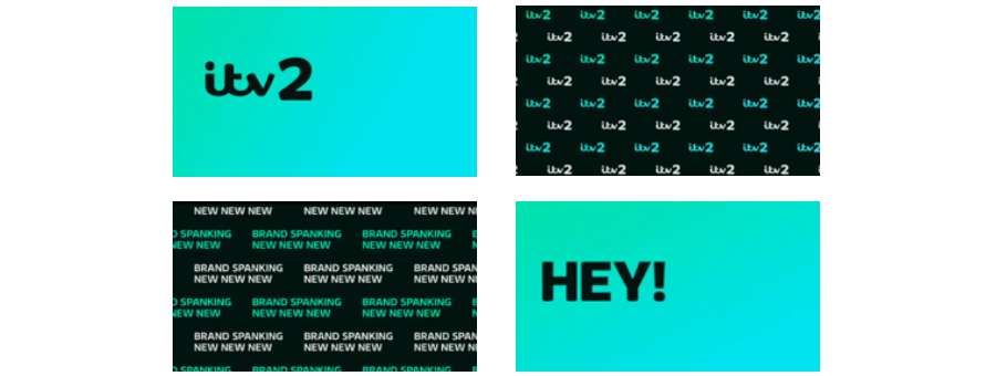
I even love the simple bright new ITV2 idents. Bright green/blue grads, strong black, bold headlines and repeated wallpapers – perfect – it’s so right.
These sub-brands give each channel its own feel while maintaining the style of the parent brand. Great work.
That’s why I was surprised when ITV1 recently had a subtle update in its execution, the promo idents between broadcasts have been given a makeover. I’m not overly keen. I think previously the balance was just right between information, images, and use of white colour(s) but the new idents feel out of kilter. They have oversized programme titles and information that remind me of when a typeface is missing from a document and it appears oversized and light.
It’s really not a good thing to be reminded of a mistake when looking at something visual. It just doesn’t seem to fit in line with the ITV brand and the great work done on it to date.

I know that the younger brand needs to continually ‘move’ to remain relevant but this feels and looks really uncomfortable to me. There’s no real need for it, it doesn’t seem to have added anything that couldn’t have been achieved in the existing ident format. I still appreciate the subtlety of the logo colour pulling from the background film, but looking at it makes me feel uncomfortable and makes me want to hit ‘apple Z’ to quickly undo experimenting with oversized headlines in the early stages of the design journey.
Sometimes even the greatest ideas and rationales look odd when visualised. Unfortunately, for me, this is one of those occasions, but hey, what we do is subjective right? That’s why we do it, why we adore it, why we just can’t stop.
Hopefully, the next shift will maintain the fun, subtlety and cleverness of the original rebrand, which I still love…