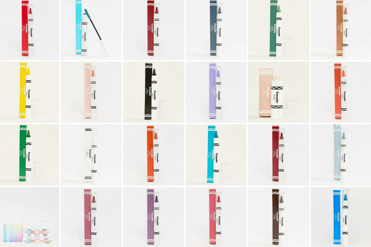
Crayola has just launched a beauty range at ASOS, and Digital Communications Manager Catie is feeling inspired.
As we all do in 2018, I see a lot of advertising on Facebook. Some of it is really well-executed and relevant, and some of it isn’t. The most standout content – or rather most standout news – I’ve seen in the past few days is from ASOS, announcing the exclusive launch of face crayons, mascaras, highlighters and other beauty products from our favourite wax crayon purveyor, Crayola, with the call to action: Shop Crayola. Go play.
Brands launch new products all the time and usually, unless they’re edible, I don’t care. But this one has stuck with me as being a move of true genius. I might not be a member of the Creative studio or Strategy team at Mobas, but of course we agency folk try to think creatively and strategically in everything we do. This is spectacularly both, for a few reasons:
1. It hits a new audience
In fact, it’s the same audience who grew up with Crayola crayons and pens firmly in their grasp, creating abstract squiggles and scribbles that ended up pride of place on the family fridge. Everyone knows Crayola but unless you’re around young children, you probably haven’t used one for a while. Now once again you can, with products staying true to that iconic crayon-shaped silhouette. There are ‘safe’ colours like the pink, red and purple hues for the traditionalists, all the way through to bolder choices like black, blue and bright yellow for more eccentric styles.
2. It’s timely
Two major trends I’m seeing among the millennial (sorry for the buzzword) generation are makeup artistry and ethical purchasing decisions.
Influencers and businesses in the beauty industry are booming and it’s becoming increasingly popular for people to be interested in makeup as a form of self-expression from a young age. At age 13 it was trendy for my friends and me to wear blue eyeshadow, concealer-as-lipstick and have over-plucked eyebrows, while now we have the same age group looking like they’ve stepped out of a salon every day. Exaggerated ‘looks’ influenced by the likes of RuPaul’s Drag Race are all the rage, and they’re not just reserved for the stage or catwalk when platforms like Instagram and YouTube make it easier than ever to learn techniques from bloggers, be inspired and recreate your favourite looks.
Crayola’s beauty products are also proudly vegan and cruelty-free. I’ll admit I have a biased view due to my own lifestyle choices, but with vegans on an ‘unstoppable rise’ it’s clearly more than just a phase for the millions of us who have switched to using products that are good on our skin and our conscience too. Another big tick for audience insight.
3. It’s on brand, times two
What would you associate with Crayola? Colour, fun, playfulness, creativity. There’s no reason why that should be limited to wax, ink and paper and, come to think of it, I’m surprised another stationery provider didn’t think of it first. Beauty products are a big enough step away from the brand to allow Crayola to diversify into a new market, while retaining those core values and brand associations.
Likewise, if you’ve ever picked up a copy of ASOS’s magazine you’ll see that it’s extremely ‘out-there’ and highly stylised in terms of quirky fashion, surrounded by content and articles about empowered young people – political and social activism, entrepreneurship, inclusivity and body positivity.
If you see me at work over the next few months with questionable makeup choices – don’t mind me, I’m just really excited to see a stroke of innovation from a childhood favourite brand.