This week you may have seen the soft launch of the BBC’s slightly updated hero logo, which has been created, according to their own news feed, in an attempt to become more ‘modern’. The general consensus within the BBC being that the incumbent brand looked ‘old-fashioned’ and ‘out-of-date’. In this insight, Creative Director Greg Bryant explains what has happened to the visual branding and why these changes don’t constitute a rebrand.
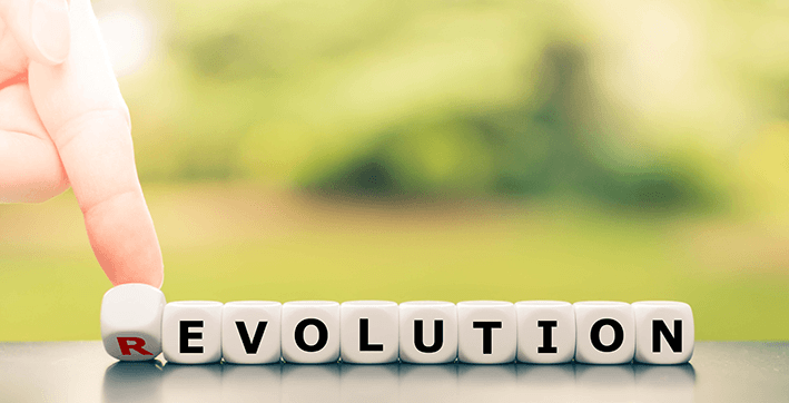
The update is undoubtably an evolution, not a revolution, with the key elements of the brand’s visual identity itself remaining very similar. The use of the three blocks, one for each letter of the corporation’s acronym, have been retained, all housing their slightly updated letter, in the slightly different choice of corporate typeface than before.
This new font has been named ‘BBC Reith font’ after the founder of the BBC, John Reith, and will supersede the current Gill Sans typeface.
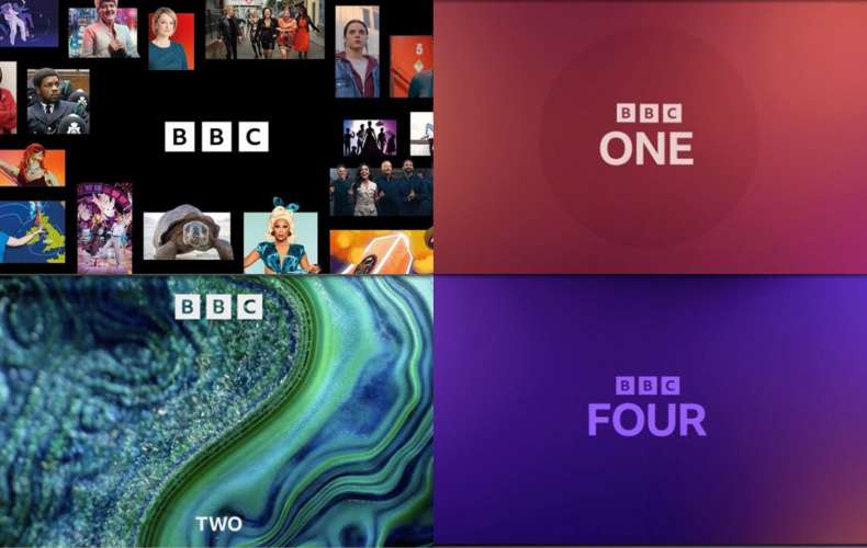
As part of its rollout the new logo will be gradually applied to all the corporation’s key TV channels (BBC One, BBC Two, and BBC Four) and international counterparts. In good news for designers everywhere, thankfully the ident visuals show that the beautiful BBC Two graphics appear to be staying.
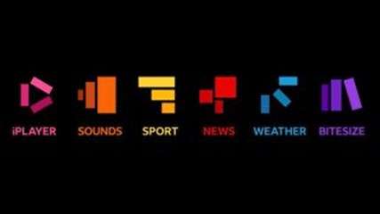
Interestingly, as part of this rebrand, the BBC’s services are also having a facelift. I am assuming the rationale behind the change is that each is made of the three blocks from the main logo (perhaps they’ll morph into each other as animations?) but retain the current colourways, e.g., iPlayer keeps its existing pink, which is well recognised, but has the three blocks in the shape of a ‘play’ button.
I can see that the motivation behind this move is to make them seem like a family of services, but there is also an assumption here that each has the same audience and that the audience wants these services to be more in line with each other. I’d argue to a point, that actually, these services are individually successful as people use them as standalone services that don’t need to be linked. I quite liked the fact that each had its own individually original ident appealing to its seperate audience, the interlocking ‘S’ of the BBC Sounds logo for example. This worked as it allowed people to use them as individual services. The new move aligns them all and there is a danger that it might turn a lot of users off. Time will tell.
So, the question remains, although this is being positioned as a rebrand, is it a rebrand in the truest sense of the word? As far as I can see, the underlying services haven’t changed, the offering from the BBC hasn’t changed, and the corporation remains inherently the same – with the same structure and beliefs. For me, this is purely a visual update, a well-considered facelift and a rebrand is much, much more than a new logo or typeface. There is so much thought and strategy that goes into a rebrand that quite often goes unnoticed by the audience but is absolutely essential.
A brand is the essence of the organisation, who you are, what you stand for, and how you are perceived both by customers and internally. Crucially it is that word ‘perception’ that is key here, your brand is what your customers perceive it to be, changing that perception takes much more than a new logo, however well-crafted it is.
A BRAND IS…
- A reflection of the essence of the offering
- Present and consistent at every touchpoint
- Expressed visually + through the culture + in our language + in ways of working
- Owned by everyone in the business
- Empowering!
A BRAND IS NOT…
- A logo
- A strapline
- A company
- A sales pitch
- One-dimensional
- Static
- Owned by marketing