

At the launch of the World Cup logo a few years ago, I loved it. The bold, striking numbers backing up the trophy itself. Really powerful and recognisable. I couldn’t wait to see how it came to life at the tournament itself.
Having now spent (too much) time watching this year’s World Cup, I’ve found myself wondering whether we’re witnessing a masterclass in tournament branding or whether things have gone a little too far.
To be clear, I’m not talking about sponsors or advertisers. I’m talking about the branding of the tournament itself.
With the World Cup being hosted across three countries, the United States, Mexico and Canada, each nation has been given its own visual identity. The distinction is largely made through relevant country graphics and colour: red for Canada, blue for the United States and green for Mexico.
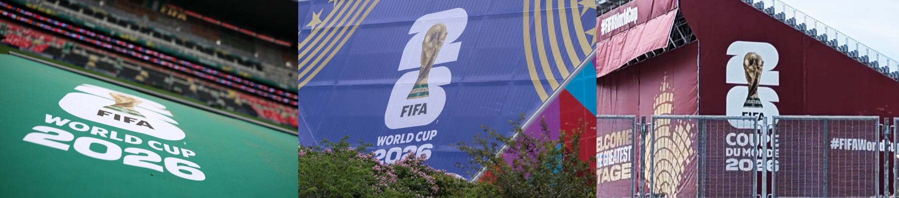
On one hand, that feels like a smart solution. Three host nations naturally have different identities, and colour provides a straightforward way to celebrate each one while still working as a single tournament.
But does it come at the expense of consistency?
Part of what makes major tournaments memorable is the feeling that every match belongs to the same event. Visual continuity helps create that. Think back to the World Cup in Qatar. The deep burgundy inspired by the host nation’s flag ran throughout the tournament. Most viewers probably didn’t consciously register it, but it quietly connected everything together.
This time around, instead of one dominant visual language, we have multiple colour palettes and bright, strong TV graphics. Does that create a richer experience, or does it fragment the identity of the tournament as a whole?
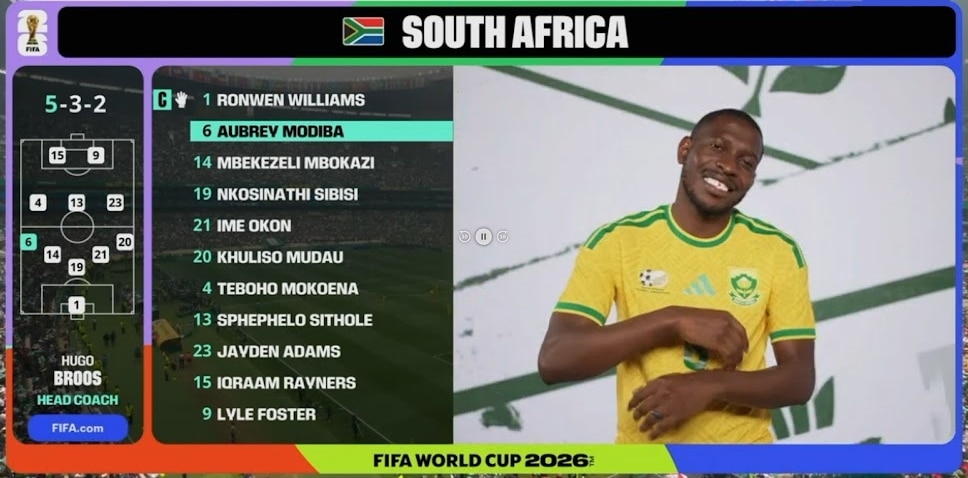
The same question applies to the tournament branding on the kits themselves.
Traditionally, every team wears the same tournament sleeve badge throughout the competition. It’s a small detail, but one that subtly reinforces the idea that every nation is participating in a shared event.
This year, however, there are multiple versions. There are light and dark variants depending on shirt colour. Then, previous World Cup winners wear a special gold version, but on darker kits those previous winners wear a white badge with gold lettering.
What was once a single tournament patch is now four different versions.
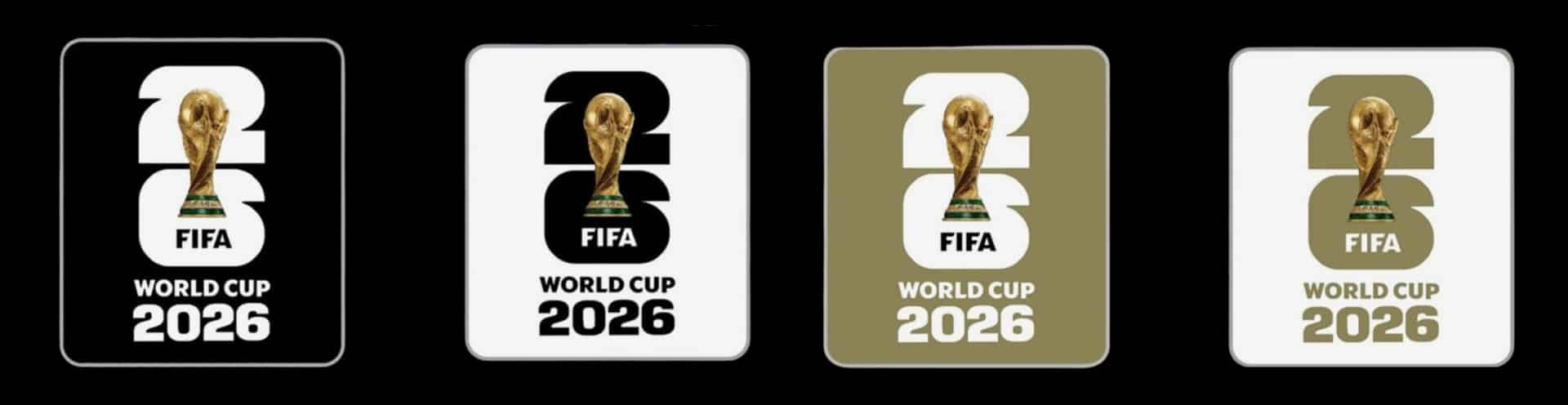
Is that a clever way to recognise achievement and improve visibility, or does it dilute the power of a universal tournament symbol?
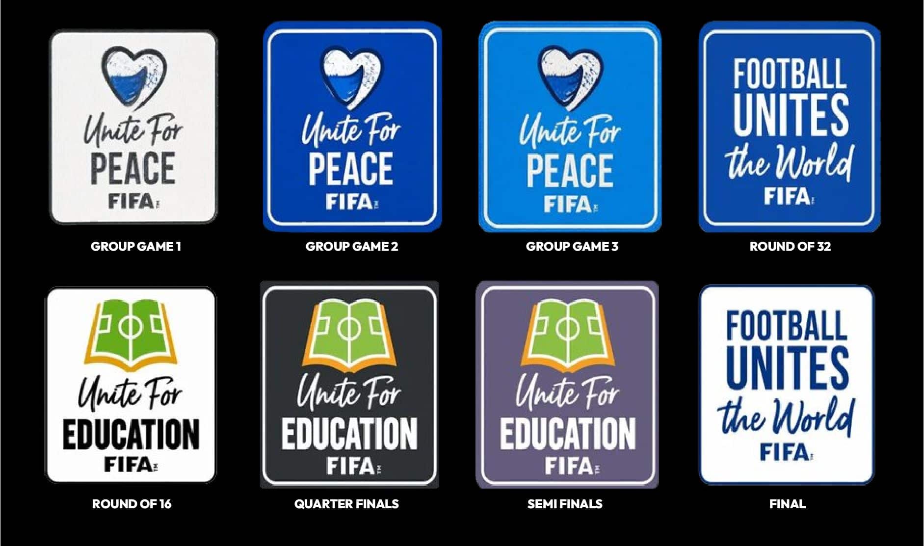
The FIFA message patch which is used on the opposite sleeve raises a similar question.
Historically, every team wore the same message throughout the tournament. This year, the message changes in every round, creating a total of eight different versions, in eight different colourways.
Is that a more dynamic and engaging approach, or does the constant variation make it harder for viewers to register the patches as part of the tournament’s visual identity?
Keeping up? We’re not done yet. Next are the player-specific patches.
Alongside the tournament badges and message patches, there are now additional distinctions for World Cup debutants, previous Golden Boot winners, previous Golden Glove winners, players who have previously been voted player of the tournament and finally players who have appeared in five or more World Cups. These particular ones are totally bespoke to the individual player.
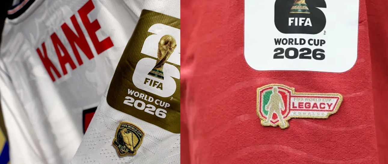
These additions provide extra layers of storytelling and recognition. Yet they also add another level of visual complexity.
At what point does meaningful recognition become visual clutter?
Even the match ball appears to be moving in the same direction.
Historically, the World Cup ball was one of the tournament’s strongest symbols of consistency. Since 1970, each World Cup has been associated with a single ball design used throughout the competition.
More recently, we’ve seen alternative designs introduced for the latter stages. If rumours are correct, this tournament could feature one ball for the group stage, another for the knockout rounds and a third specifically for the final.
That’s either a clever way to elevate key moments, or remove one of the tournament’s most recognisable constants.
Viewed individually, each decision makes sense. Different hosts, different messages, recognition for achievements, special moments marked by special designs. There’s a clear rationale behind every change.
But taken together, the cumulative effect is striking.
Three host colourways. Different broadcast graphics. Four tournament sleeve patches. Eight message patches. Five categories of player-specific patches. Potentially three different match balls.
Could we be witnessing the evolution of tournament branding? more personalised, more dynamic and more engaging than ever before or is there a point where branding stops reinforcing the tournament and starts competing with it.