PEM (formally Peters Elworthy & Moore), Cambridge’s longest-established accountancy firm, recognised that their brand needed refocusing and reinvigorating to reflect their well-respected capabilities and market position. Our initial research quickly identified the need to ensure that the brand definition is true for today, while not limiting the PEM business and acting as a springboard for the business’s future goals. We therefore concluded that an in-depth and far-reaching brand refresh project would be the most suitable direction.
- Expanding beyond its Cambridge roots
- Future-proofing the PEM brand
- Increased staff acquisition and retention
The challenge
As the largest independent firm of accountants and tax advisors in Cambridge who have been serving the local market for over 145 years, PEM is well-known within the local marketplace. Over time, the business offering and sector specialism have developed both organically and through strategic targeting.
Mobas refreshed the PEM brand in 2015 which was hugely successful, supported considerable growth and established PEM’s position as Cambridge’s leading accountancy firm. Following the external launch, the response from PEM’s clients was overwhelmingly positive, with 99% of clients rating the new brands ‘good’ or ‘very good’. But after 9 years PEM were looking to refocus for a new era and tackle the lack of brand alignment in the internal team post-Covid. In order to action these changes PEM contacted Mobas, their long-term partner, to transform their brand.
PEM came to Mobas after identifying that after a successful 9-year period the current brand definition needed to be reviewed, validated and realigned in line with the business’s aspirations for the future, building upon its strengths and unique proposition. While it’s important that the brand definition should be true for today, it should also not limit the PEM business and should act as a springboard for the business’s future goals. There may be other sectors and opportunities that the business wishes to pursue, but this can only be done effectively if the business has absolute confidence in its brand.
Through our transformative process, Mobas aimed to get under the skin of the organisation and create a brand proposition which supports and empowers team members, and makes customers and partners - both current and future - proud to work alongside PEM.

Asking PEM’s stakeholders
Mobas’s first step was to review the current brand and alignment to capture and communicate PEM’s clear and compelling point of difference in the market and to empower the business to achieve its planned growth through a considered and robust brand definition and articulation.
The growth of any business will be hampered by a brand that is poorly defined or executed; that limits a business to certain products or sectors; or that is poorly aligned to evolving market needs. From visual styling and tone of voice, to the communications channels that it uses, a brand must be built on a clearly defined and engaging proposition if it is to be an effective representation of the business. Critically it must be designed to engage its target audience and create a winning point of difference.
In order to serve both internal and external audiences, the brand must empower all communications, across multiple touchpoints, in a consistent manner. The visual identity builds a brand promise which the tone of voice, product offering and team behaviour then deliver across all media and every touchpoint. The brand must therefore be centred on a firm understanding of what the company is and what it stands for.
Research approach
Mobas’s research approach for this project included the following items:
- One-to-one staff interviews
- One-to-one client interviews
- All-staff survey
- Competitor research
- Brand asset audit
Considerations
Mobas’s research produced a set of considerations that were used when conceiving PEM’s brand transformation:
Communication: Enhanced internal communication is a clearly stated requirement. The brand should support and inspire communication across the business teams, levels and offices in order to ensure that all colleagues feel connected to each other, to the brand and to the business.
Tone of voice: The tone of voice used in all copy and content should be a consistent reflection of the brand – creating a strong sense of personality.
However, the use of language should reflect the medium in which it appears, using volume control. Low-volume language would be suitable for legal documents, while high-volume would be found in social media posts and ads.
Adding a guide to volume control and plotting key media outlets and materials to it will help to ensure that, while the brand is present in all copy, any text is really relevant for its environment.
Imagery: PEM has an established visual style which includes extensive use of Cambridge imagery.
The Cambridge connection is still strong and powerful, however consideration should be given to the impact of such images, especially those that feature historic buildings and landmarks and might lead to a perception of PEM as old- fashioned.
Going forward, imagery might be selected on the basis of showing ‘old and new’ Cambridge, with the juxtaposition of styles reflecting PEM’s ability to serve both Cambridge colleges and innovative tech start-ups.
People imagery will also be critical if the brand is to be built around relationships and service. Pictures of actual PEM staff should be supplemented with library shots as required to present an aspirational image of the team and of client relationships.
Colour: The PEM colour palette has been effective in providing variety and consistency.
While the team may tire of the PEM blue, it should be remembered that building a strong association that enables a business to take ownership of a colour takes many years and is extremely valuable.
Ownership of the PEM blue should be maintained.

Your future, our focus
PEM’s brand transformation began with the creation of new values, brand narrative and client value proposition: three items that, once approved by the client, would become the basis of all future PEM brand language and visual look and feel.
Mobas was then able to move into the production of PEM’s new messaging framework which included copy describing their association with Cambridge, an introduction to PEM and a concise description of PEM’s services.
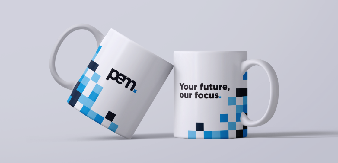
But most importantly Mobas also produced PEM’s strapline: ‘Your future, our focus’ which presents the following message: our brand positioning line does not limit us to services or geography. It is inspired by the impact that PEM delivers: for both clients and colleagues. It reflects the firm’s unique approach, creating a promise that is powerful externally and inspiring internally.
Visual modernisation
To complete PEM’s brand transformation Mobas developed a new visual style, which included the creation of a new graphic device and imagery styling.
Graphic: The graphic is designed to feel digital and unique. It is formed from the icon within the PEM logo and carries different tones of an individual colour. The graphic can contain different squares in different positions: it does not have to be the same every time. This has been specifically done so that it can flex to different shapes and sizes depending on the need of a particular item. The graphic forms a key part of the PEM brand and allows the PEM brand to have a visible presence without having to display the logo.
Imagery: Images of people are captured, real moments of professional situations, but with warmth. They highlight relationships, authority and trust. PEM’s images should focus either on the person representing PEM ‘in the moment’ or on the client’s reaction to the person representing PEM.
Images of Cambridge should feel ‘live’. To achieve this, they should always have something in them that is moving (ideally a person). The focus is not on the person, but it allows the viewer to feel like they are there, rather than simply viewing an image of a location. A mix of modern and traditional can be used to show the diversity of the city itself.
Instant internal success
PEM presented the brand transformation and employee value proposition internally on a full-company away-day, they received outstanding feedback and buy-in from all PEM stakeholders. PEM are now making full use of their new brand and it is now visible in their communications, e.g. website, social media and more…

MORE SERVICES
What we can do for you
From brand strategy, design and creative, to research and insight and digital marketing, including websites and social, take a look here.

OUR WORK
Take a look at more of our case studies
Whether financial or professional services, through established firms, scale-ups and start-ups, to healthcare, retail, property, construction and more, dive into our case studies here.
