Insights


I love an ambigram. I remember, as a child, seeing one for the first time. I was on a tube train and boredly reading the poster cards above the seats. The logo for a men’s fashion brand called New Man intrigued me. And the longer it took to reach my destination the more I examined this little gem of graphic design. Then the penny dropped – and to check, I excitedly flipped over onto my head to see what it looked like upside down, to the amusement of the rest of the carriage.
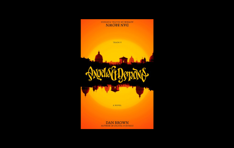
It was my first ambigram: a word, or words in this case, crafted so cleverly by its designer to read the same – or sometimes something ingeniously different (such as Derren Brown’s TRICK and TREAT cards) – the other way up. At some point I discovered the designer John Langdon whose ambigram skills were so admired by author Dan Brown that he borrowed the designer’s surname for his hero Robert Langdon (in The Da Vinci Code, etc.). Brown even commissioned Langdon to create an ambigram of the title of another of his novels, Angels & Demons, which features in the book.
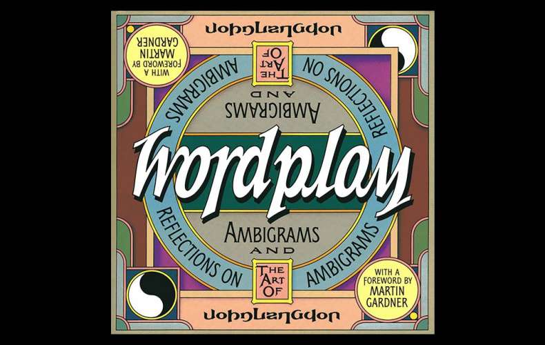
Ambigram design surely takes typographical crafting and letter knowledge to extreme heights. Sometimes a word or phrase defies belief: just when you think it would be impossible to make an ambigram of the word ‘wordplay’ for example, you take a look at the cover of Langdon’s book Wordplay and gasp. And then the way he’s written his name catches your eye… What looks effortless, and quite beautiful, is the result of meticulous experimentation and calculation. And the results never fail to delight.
Which makes them perfect for the commercial world. The public loves a logo that does a bit more than just shout the brand name. Whether patting ourselves on the head for spotting something, or taking pleasure in sharing it with others, it gets us talking about the brand without realising it.
The hidden arrow in the FedEx logo. The bear on the Toblerone mountain. The pair of feet in Scholl’s double L. The 31 in Baskin Robbins. Even the smiling arrow from Amazon’s A to Z. They may well be the result of a graphic designer showing off but they’re undeniably memorable. As are ambigrams when they make an appearance on billboards or packaging.
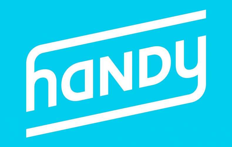
Admittedly they’re few and far between but that makes them even more noteworthy. In a bizarre flashback to my New Man moment, I spotted an ad for a company called Handy on the New York subway just a few years ago. More recently, high street chain River Island have used an RI ambigram, and the new Kia car badge almost manages it – but not quite.
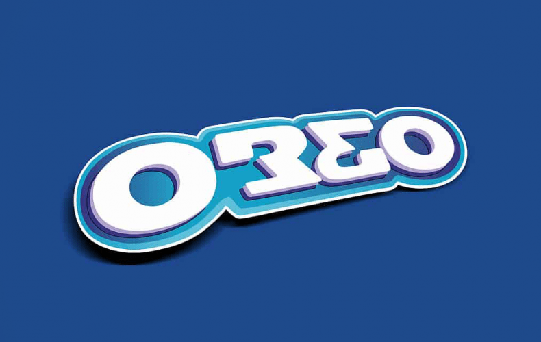
Sadly, most brand name ambigrams you can find online, such as the brilliant Oreo variation, are merely designers’ experiments and have never been adopted by the brands themselves.
If you fancy a tumble down the ambigram rabbit-hole, just Google the works of John Langdon and Scott Kim, the two masters of the art – or better still, get hold of their books. They may even inspire you to turn your own name, or that of your house or pet, into a conversation piece.