By Chloe Fuller, Designer in Mobas' Creative team.
I have always been drawn to beautiful hand-lettering. There’s just something so nostalgic about it, especially in a world where most people barely lift a pen and find it far easier just to make a note on their iPhone.
You may be wondering what exactly hand-lettering is? Well, the simplest way to put it is ‘the art of drawing letters’. Although it may seem like a dying art form, creative lettering has exploded back into the design world. It can be used in a variety of ways – logos, magazines, ad campaigns, posters, packaging – and is proven to evoke a more emotional and personal response than digital type.
You don’t need special tools but it’s a unique craft that takes a ton of practice and a lot of studying the shape and interaction of letters. You can either hand-draw pen to paper or digitally using a tablet. Once you have mastered your own style you’ll be able to letter for all occasions.
It’s important to remember that lettering is not the same as typography! They may share similarities in the fact they are both dealing with letters but typography is ‘the art of making a statement’ and uses a fixed set of letters that can be rearranged and manipulated on screen to always work together, whereas lettering produces a unique hand-drawn piece that can only be used in its original configuration. It’s crucial to remember though that the letterforms should suit their intended purpose and be stylised legibly.
Basic lettering steps:
- Sketch out your word or phrase and look at how you want to represent the letters.
- With a pencil start to map out your word or phrase in the style you want.
- When you are happy with your configuration pick your ink thickness or style and go over the top of it and style it up how you want!
- You can then also scan in your piece and use a vector program to clean it up and digitalise.
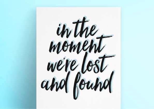
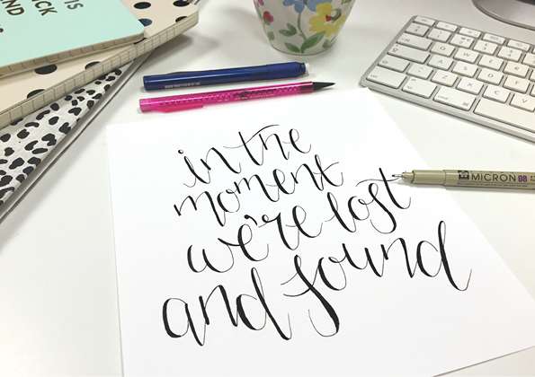
Example of hand-drawn lettering
No two letters are the same; it’s not uniform but has a distinctive and unique style.
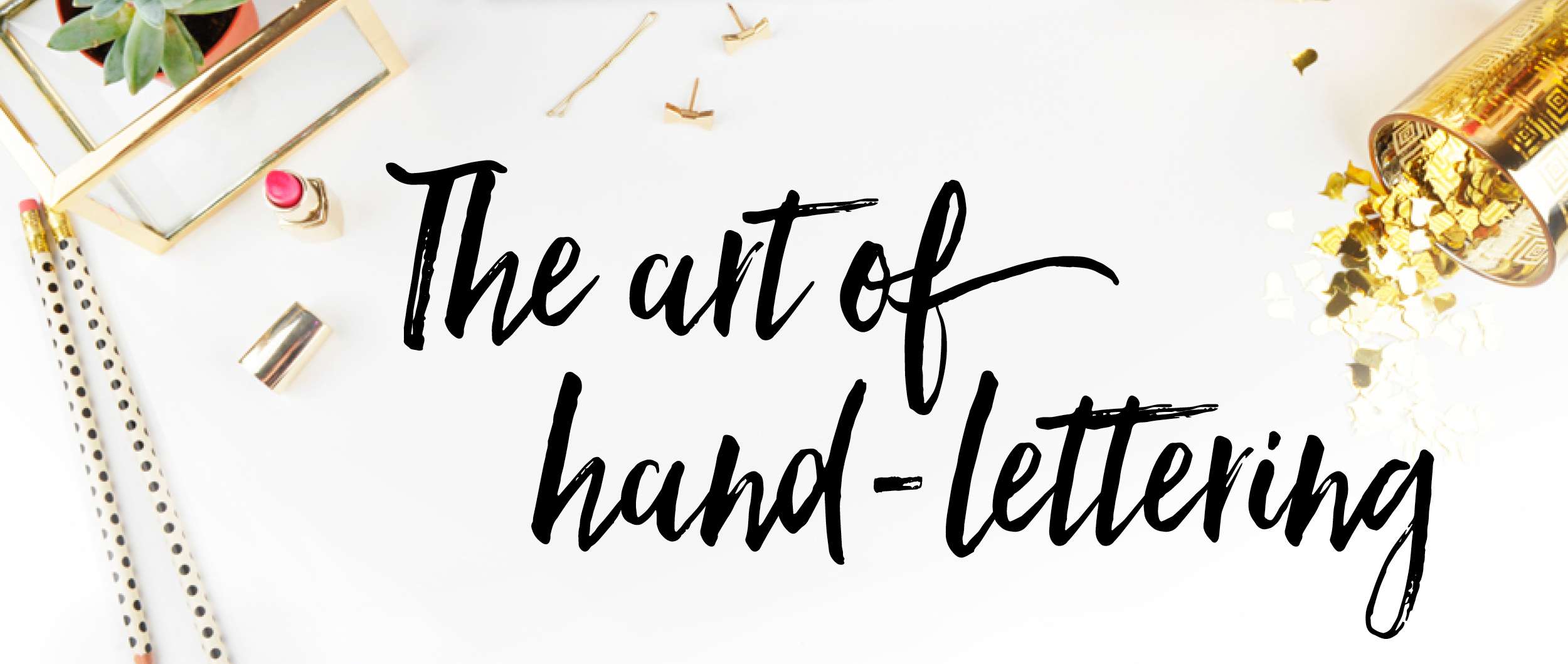
Example of digital typographical lettering
The words and letters are very uniform in style and all fit together. Each letter has the same height and sits on the baseline.