Adam Tuckwell, Director of Mobas, takes a look at the case of the London Underground font.
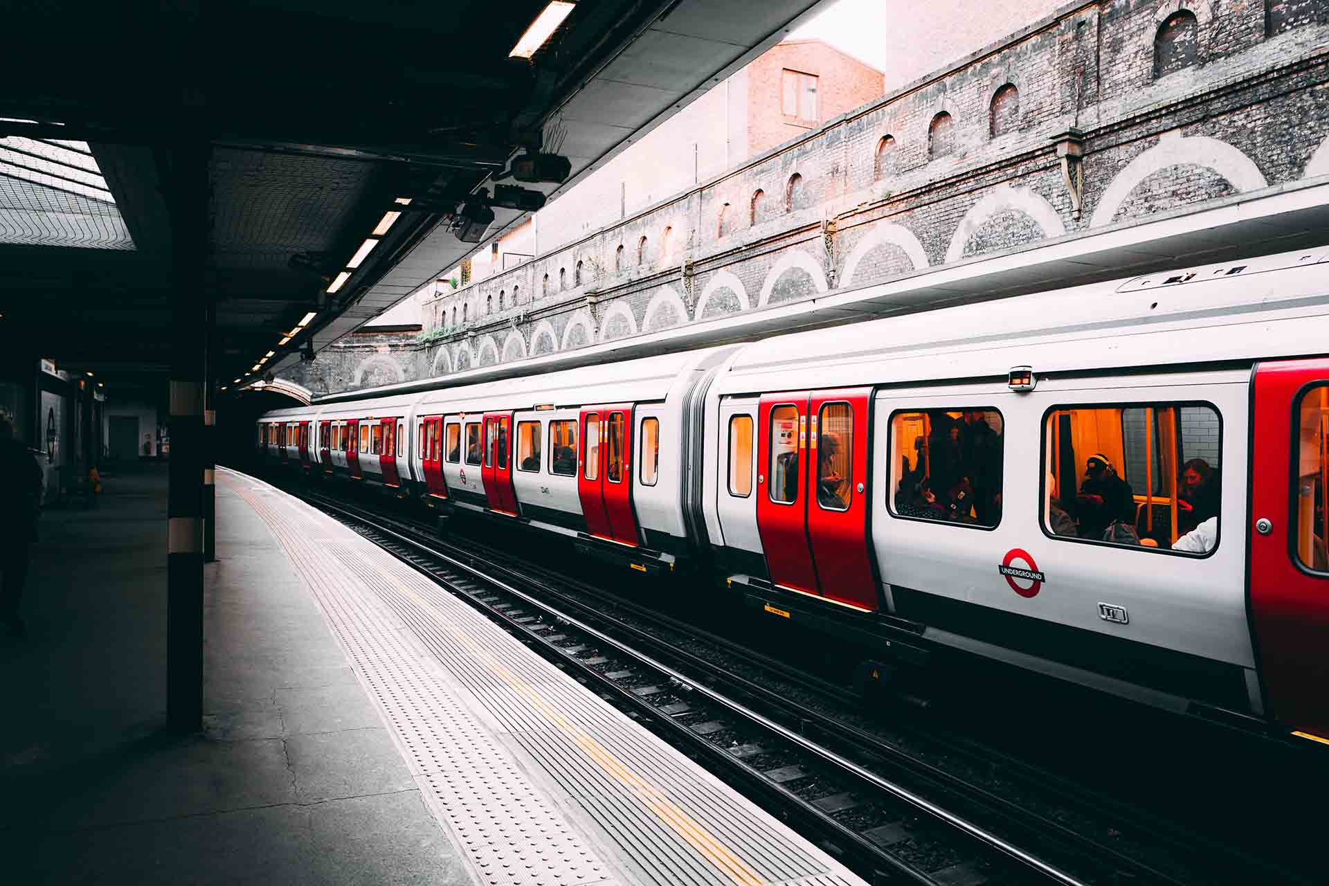
The London Underground, fondly known simply as the Tube, is more than just an underground train network – it’s an embodiment of heritage, a piece of living history. As a fan of history and cartography, I’ve admired the Underground and its iconic map since childhood. Travelling on the network today, I clocked that the train carriage numbers are also adorned with the famous font: this small detail made me reflect on how rare it is for a brand and its font to remain so relevant for such a long time and how other businesses can also learn from this, rather than rushing to evolve their look and feel constantly. Of course, the brand is widely recognised as one of the hallmark brands in the world, but I’m convinced that the power of the Underground’s brand strength actually lies in the consistency of its use.
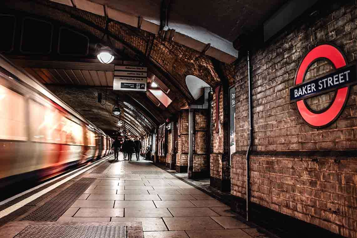
When it comes to heritage brands, the London Underground is a fantastic user story. Edward Johnston’s sans-serif typeface, first introduced in 1916, remains a cornerstone of the Underground’s brand identity today, over a century later. The Johnston typeface, with its perfect blend of legibility and aesthetic appeal, beautifully encapsulates the values of the London Underground: reliability, accessibility and cultural richness – we got that from their Wikipedia entry.
Its subsequent evolution into the New Johnston font, subtly refined for modernisation but retaining the essence of the original design, is a testament to the power of consistent brand messaging. It has proven that brand evolutions, when they do occur, need to be considered and unhurried to protect the brand’s essence and maintain recognition. This may come as a surprising statement from a design and brand agency, but we don’t always encourage our clients to jump straight into a rebrand without due cause and careful consideration.
This is a lesson for any brand and business leader with an itch to change their brand. A sudden or rushed change can confuse customers and detract from the long-standing values and trust that the brand has built over the years. After all, brand recognition plays a critical role in consumer psychology, triggering familiarity and trust.
In our rapidly evolving world, a brand’s visual identity must indeed keep pace. But evolution doesn't equate to constant transformation. Brands are not chameleons that change their colours at every passing trend. Instead, they should grow and mature while maintaining their core essence.
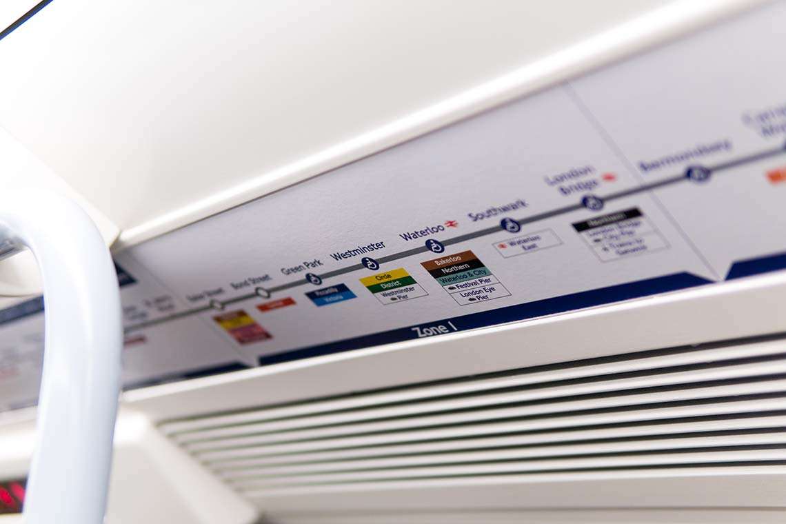
While it helps to have a great logo, font and iconography to start with, the real success of the Underground brand lies in its consistency in brand presentation. From station signs to tickets, from carriage numbers to their website, the brand is always consistently applied. While it can be easy to stray from brand guidelines and tinker with colours and fonts, we often face muddy, inconsistent and confused brand applications when our clients approach Mobas.
So what’s the lesson here? Well, it certainly isn’t to avoid a rebrand if the time is right, but more importantly, it’s to remember that a brand is an ongoing investment that needs to be nurtured and managed over time to bring the most benefit. If you’re worried that your brand has gone off the rails, contact the expert team at Mobas who’ll be happy to get you moving in the right direction.