Insights

With Euro 2016 fast approaching, and everyone desperately trying to complete their sticker albums before the first kick of a ball on 10th June, we take a look at the designs that will shape the feel of the tournament over the next month. What do they mean, where have they come from and how memorable will they be?
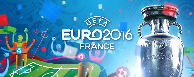
The Euro 2016 logo and visual identity
The Euro 2016 brand identity has been created by Portugal-based brand consultancy Brandia Central, which also created the identity for Euro 2012. The logo itself is ‘celebrating the art of football’ and aims to encompass the creativity of French culture with the beautiful game. Its main feature is the European Championships trophy – the Henri Delaunay Cup.
Its graphic representation appears at the centre of the logo with the colours of the French flag appearing as highlights. It is surrounded by bold solid graphics, which are designed to represent the different art movements within France, as well as depicting elements that represent the game – the hexagons of a traditional football, for example. The logo will also appear as a sleeve patch on every player’s shirt worn during the tournament, probably accompanied by the UEFA ‘respect’ logo.
![]()
![]()
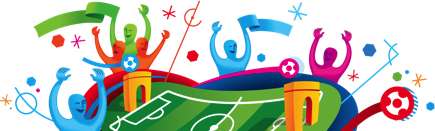
The surrounding brand and graphics are a development of this theme. Bright colours are used to create a recognisable feel to the tournament throughout. They will be used on everything from stadium branding to background banners for player and manager interview zones. The central point away from the logo is a football pitch with celebrating fans. The goals are depicted as the arc de triomphe – a symbol of the French capital where the final will be held.
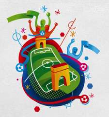
A dark blue background supergraphic is also to be used that carries different graphic elements along the ‘celebrating the art of football’ theme. This is used as the glue to hold all the devices together and completes the overall visual identity of the tournament.

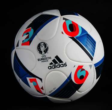
The match ball
The match ball, or ‘Beau Jeu’ to give it its official name, is created by Adidas and is built upon the same panelling design as the Brazuka ball used in the 2014 World Cup. However, some of the weighting and ‘floatiness’ issues have been resolved with this version.
The design is based around various shades of red, white and blue representing the flag of the host country.
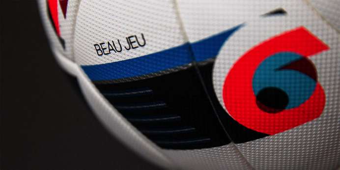
On first glance, the colour flashes appear to be random patterns giving the ball some definition. However, a closer look reveals the letters E, U, R and O overlapping with the numbers 2, 0, 1 and 6 spelling out ‘Euro 2016’. The overlapping areas are where the colour changes can be seen.
The blue ‘trails’ represent the flight of the ball flipping from a dark blue accent on light blue, to a light blue accent on dark blue – possibly to represent the day and night kick-off times during the tournament.
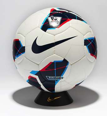
They are split with a thin silver strip to represent the colour of the trophy itself (the European Championship trophy being silver, as opposed to the gold of the World Cup). Strangely, the ball design reminds us of the Premier League ball designed by Nike and used during the 2012/13 season.
The ball design has changed subtly from tournament to tournament, with major changes in 1968 – to the traditional black and white hexagon and pentagon design – through the classic 'Tango' design of 1980, widely regarded as one of the best-looking footballs ever created, to 2004's all-silver ball with a large dark blue cross.
The ball designs for the 2008 and 2012 tournaments were modern versions of the two main previous classic designs from 1968 and 1980.
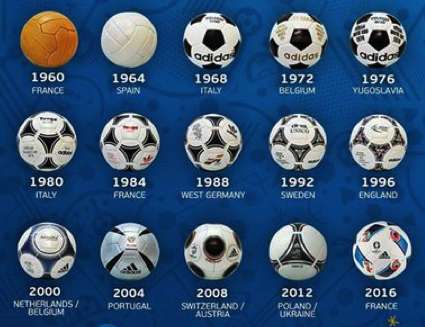
The ball design rarely reflects the full brand style of the tournament itself but occasionally contains elements representing the host country (subtle three lions and rose, for example, for the tournament hosted in England during 1996).
So, with all that in mind, will this be a tournament that sticks in the memory both from a classic design point of view, and for the memories it creates on the pitch? We’ll know that by the end of July…