In the world of marketing, we love nothing more than critiquing other people’s work and, in this blog, Mobas Director Adam Tuckwell encourages everyone to reflect on the surprising rebrand that everyone (in the world of marketing) seems to be talking about.
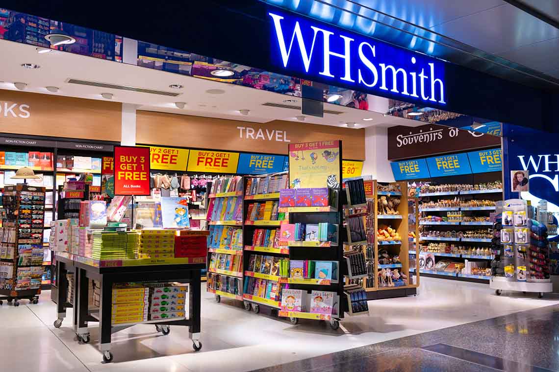
You’ve seen it, right? The new WHSmith logo – a sleek WHS in a bold typeface – is stirring up quite the online chatter and seems remarkably similar to the NHS logo we all know and love. I know what you’re thinking: it’s different and not everyone’s cup of tea. But before we join the naysayers and write it off as a poor business and branding move, let’s pause for a minute and remember that branding isn’t just about jazzing up a logo.
At Mobas we always see a rebrand as a strategic move – grounded in research and insight long before our creative team get their hands on the colour palette. WHSmith isn’t just changing fonts and colours on a whim. This rebrand is about evolving a brand that’s been around since 1792. We’re talking about a company that’s been a high street stalwart for all our lives, so the new WHS logo isn’t just a design choice, it’s a nod to the future of retail.
So why all the backlash?
The internet’s buzzing with opinions, or at least it is for those of us who the algorithms of LinkedIn and Twitter have identified as opinionated on such matters. Some branding ‘experts’ are up in arms, but let’s pause for a second. Are we all missing the point here? We aren’t privy to the research WHSmith did, nor do we fully grasp their customer base as they do. It’s easy to criticise a logo – and I can be guilty of this too – but doing so means we fall into the trap of ignoring the well-trodden path of brand development. As a former Saturday WHSmith boy, I can vouch that understanding the WHSmith customer is an art in itself. This rebrand could be hitting the nail on the head in ways we haven’t even considered if we haven’t done the legwork and just look at a new logo above the door.
As much as we like to tell ourselves that logos and visual brands are a sort of be-all and end-all, I encourage you to think more about the brand experience. Sure, if you close your eyes and think of WHSmith, your memory might be filled with back-to-school visits to get that protractor you’ll never use, but instead think about the last time you were at an airport or train station. I bet you browsed WHSmith’s shelves when you had time to kill. And while everyone mocks them for their self-serve tills, which try to tempt you to buy a Toblerone you didn’t know you needed, I challenge you to think about how you even know about that experience. I bet the answer is because you’ve all shopped there – and a new shorter name and logo that you don’t instantly love isn’t going to change that behaviour one little bit. This brand has been a silent companion on countless journeys so, when they decide to shake things up, isn’t it worth giving them the benefit of the doubt? They have, after all, been on the brand journey all the way, rather than boarding at the last stop like we all are in this brand journey.
The sad thing about the online judgement is that it overshadows some nuggets hidden in the detail. Like the news that WHSmith is thinking big – expanding in North America in 2024 sort of big. They’re not just clinging to the past, they’re leaping towards the future. This new logo might be the first step in a grander scheme of things, so while it might not be everyone’s favourite, let’s give credit where it’s due. WHSmith is taking a proactive step in an industry that’s changing faster than ever. Instead of jumping on the criticism bandwagon, let’s watch this space. They might surprise us all, so enjoy your Toblerone and carry on as you were.