Like any professional arena, the graphic design and typography field is one just crammed with jargon and vocabulary we use every day without giving a second thought to. Some of these terms have fascinating histories, often worthy of an episode of QI. Our resident logophile and Creative, Clive Weatherley, sheds some light…
Upper and lower case
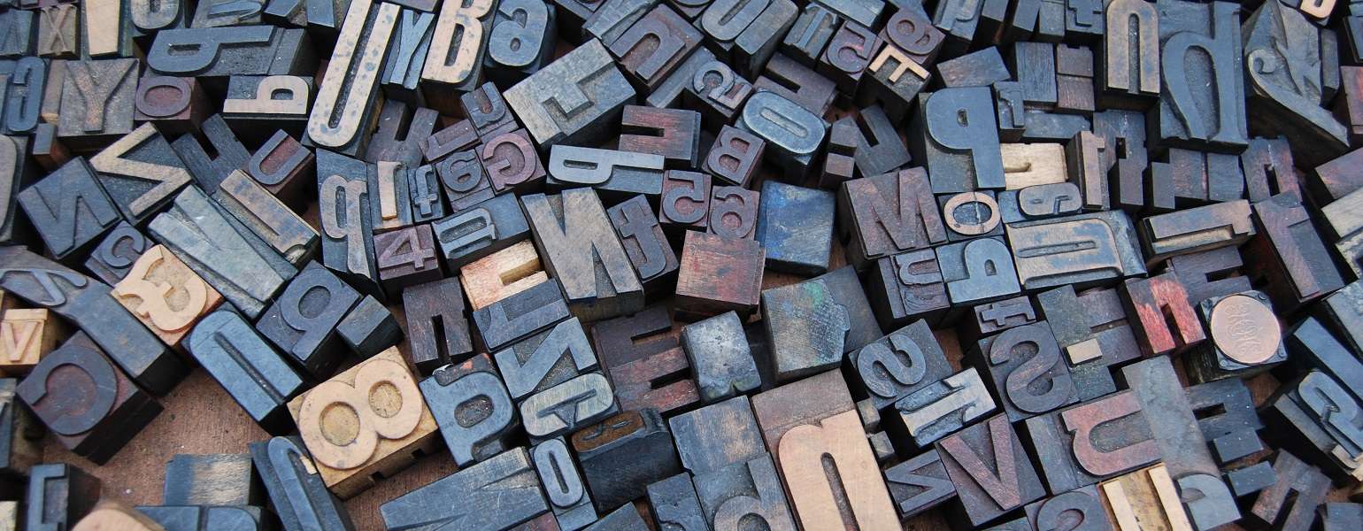
In the days of ‘hot metal’, print compositors kept all their metal letter blocks in two wooden cases, one for capitals and one for small letters, one stacked on top of the other. So they selected from the upper or the lower case.
Mind your Ps and Qs
Opinions differ but the best theory is that this phrase comes from metal letter-block typesetting too. Combine the fact that compositors were setting ‘in reverse’; the fact that lower case p and q are mirror images of each other; and the fact that they’re adjacent in the alphabet and the blocks were adjacent in the letter case – and the warning to be careful makes perfect sense.
Lorem ipsum
The filler copy commonly used since the 60s for visualising is actually a section of a genuine 1st-century BC philosophical text in Latin by Cicero – but messed about with to make it nonsensical. The title is a shortened form of Dolorem ipsum, meaning ‘pain itself’.
Foolscap
The precursor to the A4 paper size took its name from the watermark used on this size by papermakers since the 15th century – which took the form of a jester’s cap and bells.
Ampersand
In 19th-century children’s alphabet charts, the ampersand commonly appeared as the 27th ‘letter’, after Z. To make it clear that the symbol represented a whole word, kids would end their alphabet chant with “…and, per se, and” – ‘per se’ being Latin for ‘intrinsically’ or ‘in itself’. The phrase eventually slurred into the word we still use today.
Font
This word (originally denoting a specific weight, style and size of type but now often used synonymously with ‘typeface’) comes from the French verb fondre, meaning ‘to melt’, from the days when type was cast in molten metal. The verb also gives us ‘fondant’ and ‘fondu’.
Asterix and Obelix
The Belgian cartoon pair owe their names to typography. They derive from the first two superscripted reference symbols used in type: the asterisk, which everyone is familiar with, and the obelus, which most people know as the dagger.