Insights

There are various things to consider and here are just some to think about. Finding typefaces with similar personalities is a safe bet – juxtaposing two fonts with similar letter curves, for example, or other font characteristics such as the same ‘x’ height (the height from the base line to the top of the lower-case letter), is always easier on the eye.
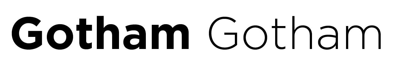
The simplest way of creating good harmony for starters is to pair two fonts from the same family. The combination of a heavy weight with a narrow one, for example Gotham Bold as the header typeface and Gotham Light as the body copy, is an obvious way to ensure typographic compatibility and consistency:
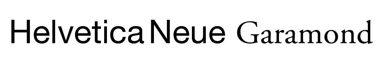
When using fonts from different families it’s important to make sure that they contrast with each other but without competing. This is imperative to a successful font pairing. Below is a successful example of a popular pair which combines a classic sans serif header typeface with a serif body font. Helvetica Neue Bold complements Garamond which is very easy to read.
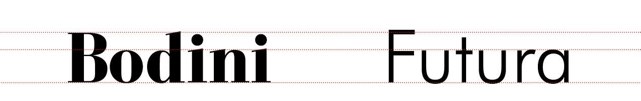
Bodini and Futura form an excellent example of two fonts which have similar ‘x’ heights. The stylishly thick, weighted Bodini is a perfect partner to the very linear Futura font.
Whatever pair is decided upon, it’s always good to have these guidelines in the back of your mind. Be aware of the situation the fonts are being used in, but also go with your instinct and – most importantly – have fun with your design!